Pridify Your GitHub Contributions Graph
I saw this Tweet…
Saw today's #Github logo and wanted my contribution graph to match with it... https://t.co/fzAlzP1474 pic.twitter.com/7FwZ0OlIdr
— Noel Delgado (@pixelia_me) June 26, 2015
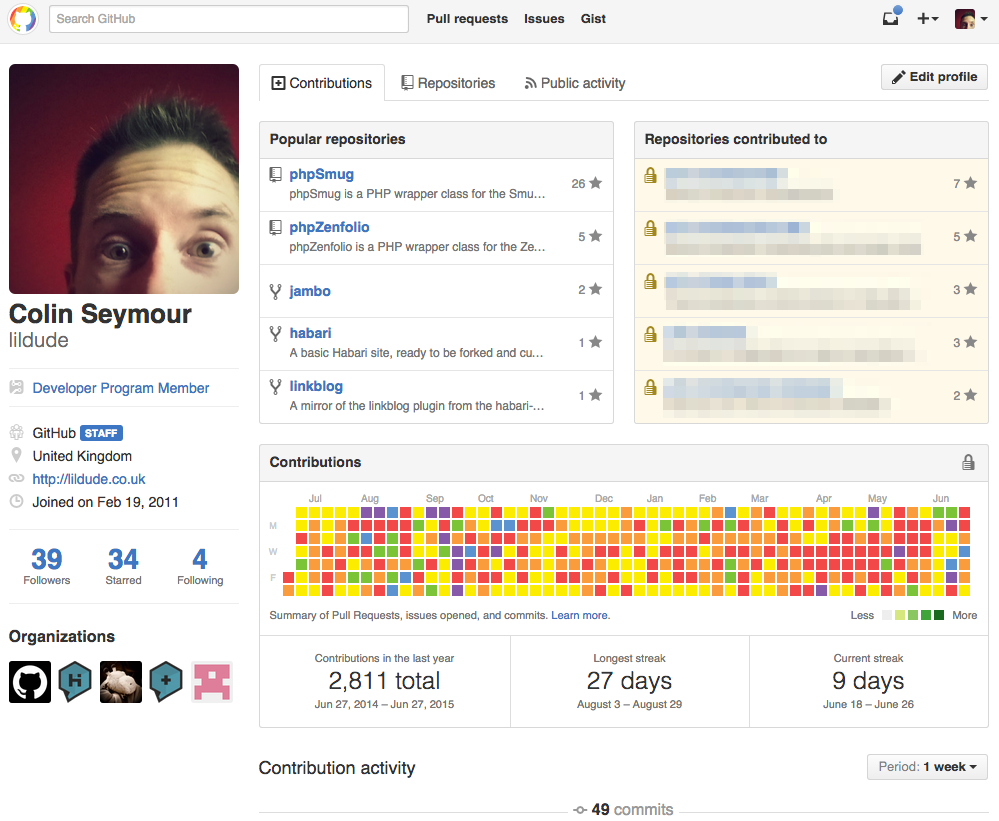
… and thought I wanted some of that too. So here you go, my "pridified" GitHub contributions graph:
For those who want to it too, and don't want to follow another link to the Gist, open up the Developer Tools in your favourite browser and paste this code into the Javascript console:
var GH = ['#EEEEEE', '#D6E685', '#8CC665', '#44A340', '#1E6823'];
var CO = ['#EF4B4D', '#F89B47', '#FAEA20', '#7DC242', '#5D94CE', '#855CA7'];

var graph = document.getElementsByClassName('js-calendar-graph-svg')[0];
var days = [].slice.call(graph.getElementsByTagName('rect'), 0);

days.forEach(function(rect) {
    switch(rect.getAttribute('fill').toUpperCase()) {
        case GH[0]: rect.setAttribute('fill', CO[2]); break; // yellow
        case GH[1]: rect.setAttribute('fill', CO[Math.floor(Math.random() * 2)]); break; // red || orange
        case GH[2]: rect.setAttribute('fill', CO[3]); break; // green
        case GH[3]: rect.setAttribute('fill', CO[4]); break; // blue
        case GH[4]: rect.setAttribute('fill', CO[5]); break; // purple
    }
});